
Lesson Activity (II)
Warm-Up Activity
Divide the class up into groups of 3-4 students and ask each group to examine a dataset and report back to the class on what they concluded. The data is related to a fictional epidemic (see below). First, the students receive attribute data related to victims of the spreading disease. Each student or group should receive a copy of the scenario below. Then give students around 5-10 minutes to discuss in their groups what the data is telling them.
Once groups have had a chance to discuss their theories, have them share their ideas whit the rest of the class and write them on the board. Ask probing questions about the students’ ideas without revealing anything about their accuracy. Before moving on to the next step, ask students what other information would help them figure out the origin of the epidemic and write those ideas on the board.
Finally, show students the Phase 2 Data and Map. Ask students to look over the table and map for 2-3 minutes before rejoining as a class to discuss their revised theories.
Questions for students to consider:
-
- What additional attribute data (non-spatial) would have helped you come to your final conclusions?
- What does the map do to help strengthen a persuasive argument you might make about the source of the outbreak? If you were presenting your findings to an authority, do you think having a map would help you tell a more convincing story?
Discussion
The exercise you just completed was not entirely fictional. It was based on the real research techniques applied by John Snow in 1854 to a deadly Cholera outbreak gripping London. By mapping the outbreak, he was able to link the rash of infections back to one contaminated water pump. Snow recognized the power of locating information in place and was able to solve a deadly problem terrorizing his city.
Phase 1 Data:
A small farming community has been ravaged by mysterious and severe illness. Ten people have already come down with this frightening disease. The village is at a loss as to how the sickness is spreading. The local doctor has collected data on all the victims. Based on the data below offer two working hypotheses on the origins of the illness that the community can use to try and control the spread.
| Name | Diagnosed | Age |
| Wallace Jefferson | August 1st | 21 |
| Peter Baker | August 31st | 5 |
| Michael Park | September 11th | 32 |
| Terrence Pearson | August 5th | 30 |
| Wilbert Watson | October 1st | 51 |
| Oliver Nelson | September 19th | 40 |
| Kelli Wong | August 15th | 63 |
| Woodrow Park | August 11th | 10 |
| Earnest Palmer | September 5th | 18 |
| Perry Luna | October 1st | 18 |
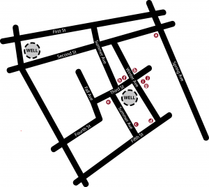
Phase 2 Data:
Another town member decided to collect location data for the patients. How does using this data and the map provided change your understanding of the outbreak?
| Name | Diagnosed | Age | Location |
| Wallace Jefferson | August 1st | 21 | a |
| Peter Baker | August 31st | 5 | b |
| Michael Park | September 11th | 32 | c |
| Terrence Pearson | August 5th | 30 | d |
| Wilbert Watson | October 1st | 51 | e |
| Oliver Nelson | September 19th | 40 | f |
| Kelli Wong | August 15th | 63 | g |
| Woodrow Park | August 11th | 10 | h |
| Earnest Palmer | September 5th | 18 | i |
| Perry Luna | October 1st | 18 | j |
Primary Activity
After demonstrating the potential benefits of thinking spatially, ask students to consider the ways that spatial thinking can be applied to problems our society faces today.
“Let’s return to our discussion about racial covenants. Did you see value in having a map of racial covenants versus reading the primary sources alone? How does the map help give us a new understanding of structural racism? Why does it help to see a problem?”
Ideas for students to consider in this discussion:
-
- Spatial thinking helps us to understand how place impacts an issue.
- Maps help tell a story convincingly.
- If we know where something happened, it can enable us to compare it across time.
- Spatializing data can allow us to compare it more easily to other variables that effect that area.
“Covenants happened in the past though, right? But we still can use a map of them to understand the present. How can we extend the map that we saw of covenants to help it say more about the inequality we see today?”
-
- Gather a brief list of ideas from students.
Next, present students with the Covenant Data Explorer map.
“We are going to spend some time trying to apply the type of spatial thinking that we practiced earlier to racial covenants. How can we apply spatial thinking to understand this problem? First, let’s talk about how to read a map like the ones we are going to look at.”
How to read a map
We are probably all used to reading navigational maps, or maps that tell us where things are and how to get there. But we have been working with thematic maps or maps that tell us something about the character of what is happening at a location. A very common form of thematic mapping is the Choropleth Map. These maps use bounded areas to display the degree to which a particular phenomenon is present in that area compared to other areas. This video gives an explanation of how to understand and use a choropleth map:
The Covenant Data Explorer map is divided into tabs. Each tab compares covenants to another layer of data in Minneapolis or Hennepin County. For the Activity, students will divide into groups, each taking an individual tab to discuss and analyze.
Group Exercise
- Break students into groups of 3-4
- Assign each group map to analyze
- Ex: Group 1 will work on analyzing the information in the tab labeled “non-white population”
- There are six comparison layer tabs in addition to the covenant only tab
- Historical HOLC/”redlining” map – Historical Discriminatory Policy
- Non-white population (2013-2017) – Contemporary Segregation
- Black population (2013-2017) – Contemporary Segregation
- Adults with less than a 9th-grade education (2013-2017) – Educational Disparities
- Population living below the poverty level (2013-2017) – Economic Disparities
- Population with multiple jobs (2015) – Economic Disparities
- Ask students to study their layer tab and the accompanying explanation and answer the following questions to report to the rest of the class during the discussion (see the Layer Guide for corresponding information for each of the layers):
- What information is your comparison layer showing?
- Describe the distribution of the comparison layer.
- Where are covenants in relation to the comparison data distribution?
- (*optional*) What is your data’s spatial relationship to historically relined areas?
- Summarize what we can say about this contemporary or historical phenomenon and its relationship to covenants.
- Brainstorm ideas about how we can make the links between the covenant data and the comparison data more robust.
- What other data sources would be interesting to analyze in relation to this dataset?
Layer Guide:
See the side panel of each tab in the Covenant Data Explorer map to find the details below.
Layer 1: Historical HOLC/”redlining” map – Historical Discriminatory Policy
What information is your comparison layer showing?
- Redlining was a historic practice instituted by the homeowner’s loan corporation. The map depicts the HOLC rankings using color-coded polygons. The colors correspond to a ranking of the perceived desirability and safety of investment assigned to an area. Green indicated “best,” blue “still desirable,” yellow “definitely declining,” and red “hazardous.” Narrative descriptions were provided by the HOLC justifying the grade given to each area. “Redlined” areas have justifications that explicitly reference the racial character of the area, citing diversity as acceptable reasons for questioning the reputability of a neighborhood.
Describe the distribution of the comparison layer.
- Red areas, or places deemed “hazardous” for investment, are generally located toward the center of the city with yellow areas ringing them, and blue areas surrounding those, taking up the bulk of the southern end of the city. Green areas are more spotted. The largest green area is in south Minneapolis running between Lake Harriet and Lake Nokomis along the southern border of the city. Other isolated pockets of green pop up in northeast Minneapolis and along the western edge of north Minneapolis.
Where are covenants in relation to the comparison data distribution?
- The vast majority of covenants fall in blue or green areas of the map.
(*optional*) What is your data’s spatial relationship to historically relined areas?
- See above
Summarize what we can say about this contemporary or historical phenomenon and its relationship to covenants.
- Covenants came about prior to redlining (though not all the covenants shown on the map were there at the time that the redlining map was drawn in 1935. About 60% of covenants show up before 1935, but the majority of that 60% are in the city of Minneapolis and the remaining 40% are added to areas outside of the city.)
Brainstorm ideas about how we can make the links between the covenant data and the comparison data more robust.
- Use statistics to show how many covenants are in each of the color grades.
What other data sources would be interesting to analyze in relation to this dataset?
- Contemporary demographics
- Contemporary housing values
- Crime rates
Layer 2: Non-white population (2013-2017) – Contemporary Segregation
What information is your comparison layer showing?
- This map is a visualization of contemporary segregation. This layer is showing the distribution of non-white residents between 2013-2017. The map is divided into census tracts based on the 2010 census data. The data was collected as part of the American Community Survey.
Census tracts with a higher concentration of residents of color are shaded darker, while tracts with fewer residents of color are shaded lighter.
Describe the distribution of the comparison layer.
- According to this data, the areas with the highest concentrations of residents of color are toward the center of the city, southwest of the river and in the northwest quadrant of the city.
Where are covenants in relation to the comparison data distribution?
- Covenants are concentrated in the lightest census tracts. Darker tracts, or those with more residents of color between 2013 and 2017 almost no coincidence with covenants.
(*optional*) What is your data’s spatial relationship to historically relined areas?
- Historically “redlined” areas have greater populations of color.
Summarize what we can say about this contemporary or historical phenomenon and its relationship to covenants.
- Covenants came about prior to redlining (though not all the covenants shown on the map were there at the time that the redlining map was drawn in 1935. About 60% of covenants show up before 1935, but the majority of that 60% are in the city of Minneapolis and the remaining 40% are added to areas outside of the city.)
Brainstorm ideas about how we can make the links between the covenant data and the comparison data more robust.
- Use statistics to show how many covenants are in each of the color grades.
What other data sources would be interesting to analyze in relation to this dataset?
-
- Contemporary demographics
- Contemporary housing values
- Crime rates
Layer 3: Black population (2013-2017) – Contemporary Segregation
What information is your comparison layer showing?
- This map is a visualization of contemporary segregation. The blue shaded areas on the map indicate the percentage of non-white residents. The darkest areas have 50% or more residents of color, while the lightest areas have between only 2 and 15% (see full legend below). This data reflects what the city looked like between 2013 and 2017.
Describe the distribution of the comparison layer.
- Black residents are concentrated in the northwest and central to central-southeast parts of the city. The number of areas that contain 50% or more of black residents in 2013-2017 is fairly small.
Where are covenants in relation to the comparison data distribution?
- Covenanted areas seem to “ring” the areas with higher black populations. And the existence of a covenant corresponds almost always with a drop in the black population.
(*optional*) What is your data’s spatial relationship to historically relined areas?
- Areas that have higher black populations were historically “redlined.”
Summarize what we can say about this contemporary or historical phenomenon and its relationship to covenants.
- Even more, than half a century after covenants are illegal, there is a clear demarcation between areas that were covenanted and areas that have significant numbers of black people living in them today.
Brainstorm ideas about how we can make the links between the covenant data and the comparison data more robust.
- Measuring the instances of black residents in areas with racial covenants.
What other data sources would be interesting to analyze in relation to this dataset?
- Home values
- HOLC/redlining data
- rental vs home-ownership rates
- educational outcomes
Layer 4: Adults with less than a 9th-grade education (2013-2017) – Educational Disparities
What information is your comparison layer showing?
- This layer shows concentrations of adults with lower than 9th-grade education. The darkest areas have concentrations of 11 to 30 percent while the lightest areas have a maximum of 2 percent.
Describe the distribution of the comparison layer.
- The highest concentrated areas appear in the northwest and central-southeast regions of the city.
Where are covenants in relation to the comparison data distribution?
- There are very few areas with high concentrations of low education adults in areas with covenants.
(*optional*) What is your data’s spatial relationship to historically relined areas?
- The highest concentrations coincide with yellow (“declining”) and red (“hazardous”) areas.
Summarize what we can say about this contemporary or historical phenomenon and its relationship to covenants.
- Historically covenanted areas have a comparatively low incidence of low-education adults as compared to areas that were not covenanted (the disparity is even greater when comparing areas that were historically “redlined” vs areas that were historically covenanted).
Brainstorm ideas about how we can make the links between the covenant data and the comparison data more robust.
- Compare the areas with high education adults to covenants (and other levels on the educational scale).
What other data sources would be interesting to analyze in relation to this dataset?
- Home values
- HOLC/redlining data
- rental vs home-ownership rates
Layer 5: Population living below the poverty level (2013-2017) – Economic Disparities
What information is your comparison layer showing?
- This layer visualizes areas with higher and lower concentrations of residents living below the poverty line. The darkest areas are areas with between 30 and 72% of residents living below the poverty line. The lightest areas have a maximum of 6% living in poverty.
Describe the distribution of the comparison layer.
- The areas with the highest concentrations of residents in poverty are the northwest and central-southeast areas of the city.
Where are covenants in relation to the comparison data distribution?
- Covenants are concentrated outside the areas with high concentrations of poverty.
(*optional*) What is your data’s spatial relationship to historically relined areas?
- The highest concentrations of poverty coincide with yellow (“declining”) and red (“hazardous”) areas.
Summarize what we can say about this contemporary or historical phenomenon and its relationship to covenants.
- Areas with covenants are less likely to have higher concentrations of people living in poverty as recently as 2017.
Brainstorm ideas about how we can make the links between the covenant data and the comparison data more robust.
- Statistical measures of the coincidence of covenants and poverty. It would be useful to have a statistical measure of the difference between poverty levels in areas with a high incidence of covenants versus areas that were historically “redlined.”
What other data sources would be interesting to analyze in relation to this dataset?
- HOLC/redlined areas
- Educational outcomes
- Home values
- Rental versus home-ownership rates
Layer 6: Population with multiple jobs (2015) – Economic Disparities
What information is your comparison layer showing?
- This layer visualizes concentrations of residents with multiple jobs. Having multiple jobs is an indication of high instances of part-time and low wage work. This data can be thought of as a measure of economic security. Areas with the highest concentration have between 9.6 – 15.5% of the population are multiple jobholders and areas with the lowest concentration have between 4.3 – 6.7%.
Describe the distribution of the comparison layer.
- The highest concentrations are located in the northwest corner of Minneapolis as well as the central-southeast and lower southeast areas of the city. Northern suburbs like Brooklyn Center, Brooklyn Park, and New Hope also have high concentrations of multiple jobholders.
Where are covenants in relation to the comparison data distribution?
- There are instances where covenants coincide with high concentrations of multiple jobholders, but there is a “ring” type effect where highly covenanted areas tend to lie outside the areas with high instances of multiple jobholders.
(*optional*) What is your data’s spatial relationship to historically relined areas?
- Low concentrations of multiple jobholders tend to correspond to areas historically “greenlined” (“best”) or “bluelined” (“still desirable”).
Summarize what we can say about this contemporary or historical phenomenon and its relationship to covenants.
- Areas with higher concentrations of covenants have tended to be lower on the scale of high concentrations of multiple jobholders.
Brainstorm ideas about how we can make the links between the covenant data and the comparison data more robust.
- Statistical measures of the correlation between covenants and multiple jobholders.
What other data sources would be interesting to analyze in relation to this dataset?
- Income measures
Continue to the Discussion Section
During the twentieth century, racially-restrictive deeds were a ubiquitous part of real estate transactions. Covenants were embedded in property deeds all over the country to keep people who were not white from buying or even occupying land; their popularity has been well documented in St. Louis; Seattle; Chicago; Hartford, Connecticut; Kansas City and Washington D.C.
Though covenants were everywhere, they did mutate over space and time. Those authored in the first years of the twentieth century have a different flavor than those recorded after World War II. The racial preoccupations of developers in Washington state were different from those of North Carolina. But all of these documents were blunt. For example, one common Minneapolis covenant reads: "the said premises shall not at any time be sold, conveyed, leased, or sublet, or occupied by any person or persons who are not full bloods of the so-called Caucasian or White race."
In Minneapolis, the first racially-restrictive deed appeared in 1910, when Henry and Leonora Scott sold a property on 35th Avenue South to Nels Anderson. The deed conveyed in that transaction contained what would become a common restriction, stipulating that the "premises shall not at any time be conveyed, mortgaged or leased to any person or persons of Chinese, Japanese, Moorish, Turkish, Negro, Mongolian or African blood or descent."
Structural racism is the formalization of a set of institutional, historical, cultural, and interpersonal practices within a society that materially advantages some racial groups while disproportionately disadvantaged otherized racial groups. These advantages and disadvantages are compounded and passed down over time and transmitted from one generation to the next, regardless of the role individuals played in the origins of the process.
Further reading: “Stamped From the Beginning Stamped from the Beginning: The Definitive History of Racist Ideas in America,“ Ibram X. Kendi
Choropleth Maps display divided geographical areas or regions that are coloured, shaded or patterned in relation to a data variable. This provides a way to visualise values over a geographical area, which can show variation or patterns across the displayed location.
The data variable uses colour progression to represent itself in each region of the map. Typically, this can be a blending from one colour to another, a single hue progression, transparent to opaque, light to dark or an entire colour spectrum.
One downside to the use of colour is that you can't accurately read or compare values from the map. Another issue is that larger regions appear more emphasised then smaller ones, so the viewer's perception of the shaded values are affected.
A common error when producing Choropleth Maps is to encode raw data values (such as population) rather than using normalized values (calculating population per square kilometre for example) to produce a density map.
(source: https://datavizcatalogue.com/methods/choropleth.html)